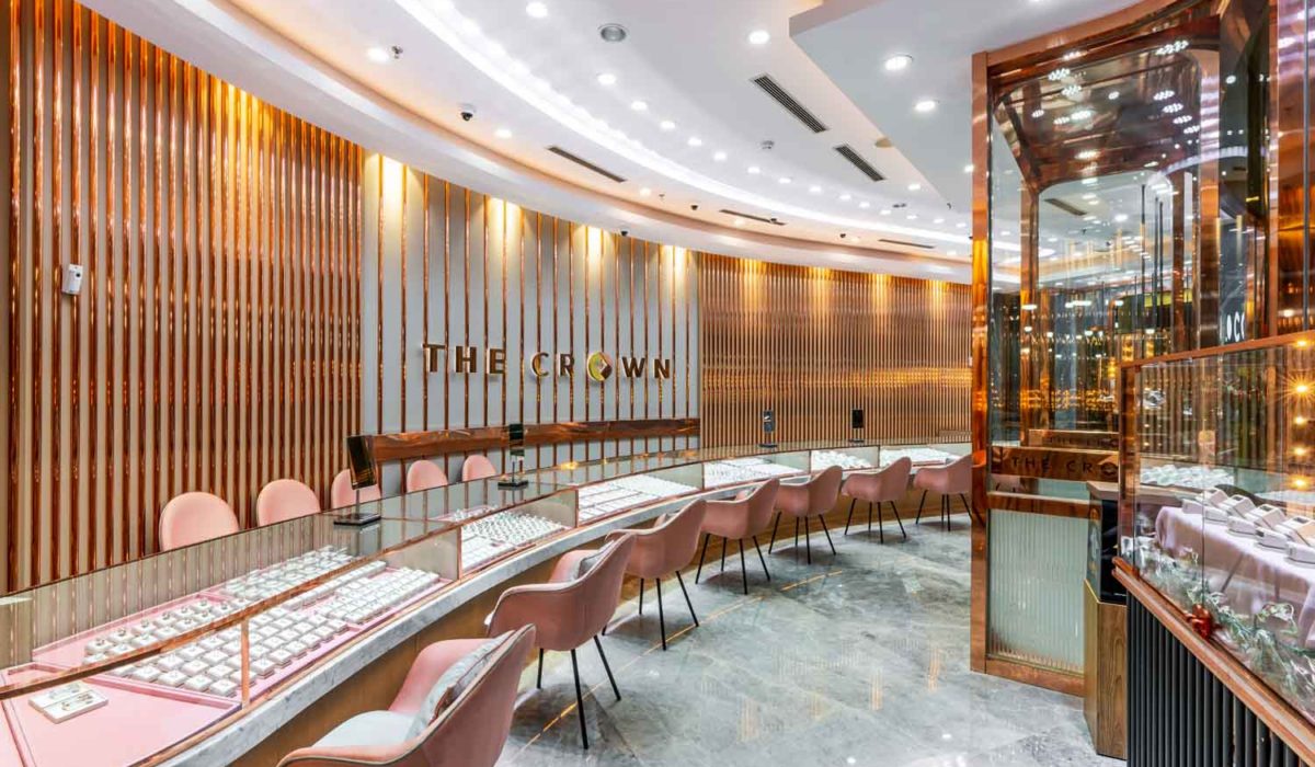
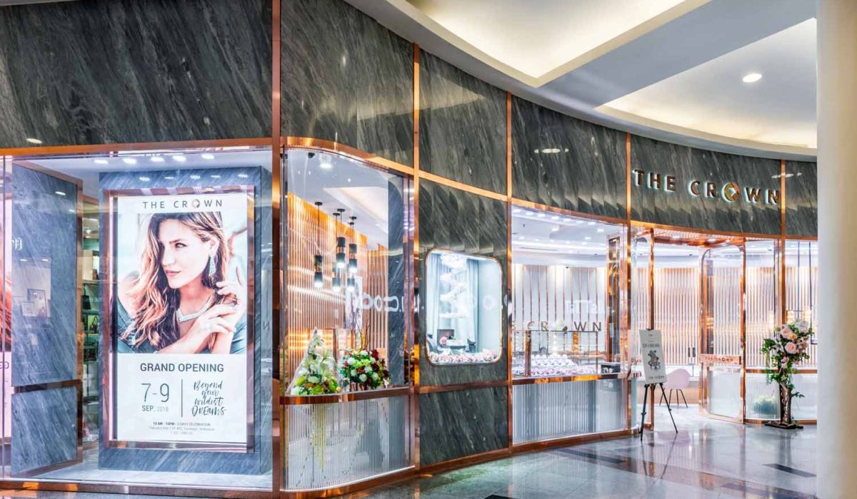
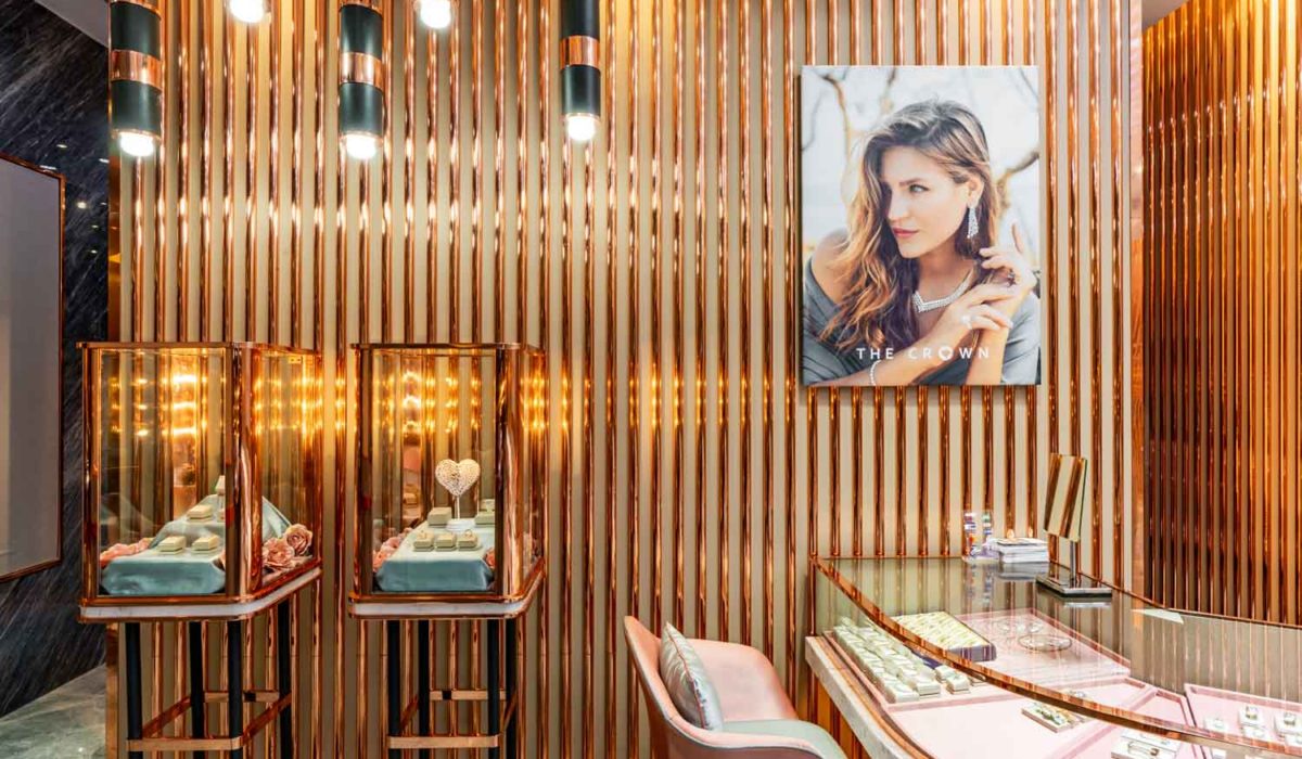
Being different than typical jewelry stores, The Crown was designed with unique approach.
The dominant usage of rose gold in paneling and pink hues in the space has set the trademark for the brand. This resonates with the concept of representing elite women elegance and charm. Window display is an integral part in creating this design to ensure the products are getting the spotlight they need in this shimmering runway.

To compliment the elegance exhibited by the rose gold bronze frames/lists, alluring grey marble covers the surrounding wall inside and outside the store. The choice of marble material is intended with the purpose to upscale the retail experience for incoming guests to the store. Despite the association of pink colour to femininity, we believe the grey colour neutralise and brings out well-played colour coordination.
As an Indonesian interior design consultant, we want to provide a different atmosphere, which is more emphasized by its detailed ornaments and pendant lights. Properly set-up lighting is very crucial for creating ambience. In jewelry stores especially, this plays major role for the users’ experience. The overall renovation revamped the whole brand and set a comfortable retail experience.


