Kappa Sushi has become one of the major Kaiten Zushi chains in Japan. Kaiten Zushi or “conveyor belt sushi” are sushi restaurants where sushi, and more recently; noodles, fried foods and desserts are served from a conveyor belt. The first Kappa Sushi restaurant was opened in Nagano City, Nagano Prefecture in 1979 and has been in business for more than 40 years with 325 stores nationwide, acquiring a large fanbase of all ages. And we as interior design jakarta who are trusted to handled this project, are beyond excited to be able to take part in delivering Kappa Sushi to the market in Indonesia, specifically located in Central Park Mall, Jakarta.

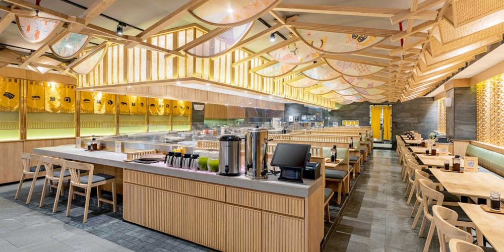
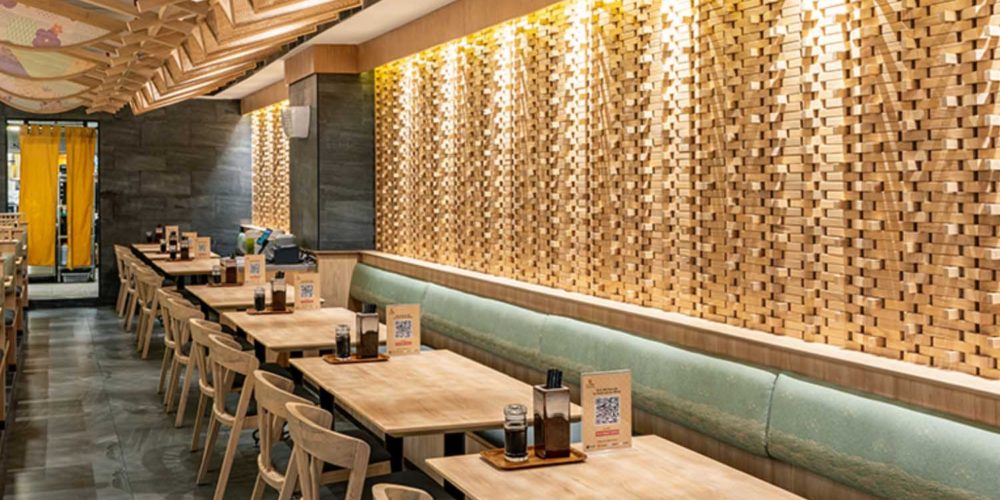
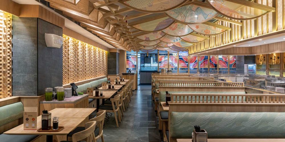
The exterior, as well as interior presenting a strong visual of Japanese characteristics. When you step into the restaurant, you will notice the dominance use of wood in the interior design. With warm color embracing the walls, complemented with the colorful ceiling, it sure gives a dynamic design to attract the customers. The main design concept was inspired by Sensu, a Japanese foldable fan made of paper on a bamboo frame, usually with a design painted on them. This Sensu is then implemented in the interior design process to produce what is now presented in the store.
As mentioned above, this Sensu is creatively used throughout the design, especially the front area and ceiling inside the space. The shape of Sensu itself creates a unique scenery of the ceiling. The arched form of the Sensu softened the rigidness of the wood frame used to build the entire space. It is a great way to create a balance of the design and elements in it. The Sensu is also accentuated by the use of printed fabric with artistic Japanese ornaments and patterns which creates a fun and colorful accent of the space. When you look it form a straight point of view, the Sensu creates a scale-like pattern of a fish, which resonates with the brand itself of serving fish as one of their main dishes. And that would be another attractive point to draw people to want to look closer and come inside.
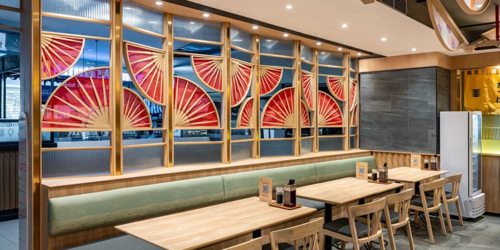
Red has always been the color to intrigue people’s attention. This is why it is used in the storefront, by applying it on a zig-zag pattern, which inspired from a folded Sensu, one side was plain wood while the other painted red, it creates a subtle gradation that results in two different perspectives when you walk through it from the right or left side. And besides red, the color gold is also used as an accent on several parts of the interior, such as the window frame encasing the red fan on the storefront. This is due to the color identity of Kappa Sushi itself, where we determined to well present it from the brand image to the customer.
Overall as interior design Jakarta we wants to give the best in every task assigned to us. Our interior design project for Kappa Sushi shows how a traditional inspiration can be combined and even unified with a modern interpretation and resulted in a beautiful work of art. It needs good planning, strong intuition, good knowledge and passion to ensure those combination can strengthen each other’s traits while not ignoring the main identity of the brand itself.
By the-metaphor


